
August 14, 2013
Infographic or Just Another Chart?
One of the hottest visual design tools out today is the informational graphic, known as an infographic. According to Wikipedia, they are graphic visual representations of information, data or knowledge intended to present complex information quickly and clearly.They can improve cognition by utilizing graphics to enhance the human visual system’s ability to see patterns and trends.
But we’ve known that graphic representation of information or data has been typically represented in charts and graphs. So what makes infographics different from simple chart or graph? Many would dress up a chart or graph with icons or clip art to represent the data in a different way, but I don’t believe it makes an effective infographic.
While the “dressed up” chart might support the data or conclusions drawn from the data, it only supports the story. Rather an infographics should tell the story. An effective infographic presents the data or knowledge in a way that visually makes the reader understand the information without having to read a written story.
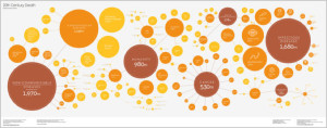
The infographic above uses very few words, but visually tells the story of how people have died in the 20th century. Maybe not the most compelling subject to talk about, but you can see that this picture definitely tells a story. When using visual images or icons to display information, make sure you can tell the story with few words.